Not a Painting, Nor a Common Object: Waxing on Los Angeles & The Colby Poster Printing Company
With Kristian Henson
Image by Christopher Michilig & Devening Projects + Editions
Photography by Joshua White
The landscape of Los Angeles is simultaneously a sun-bleached paradise and decaying post-industrial wasteland. This unique conflicted beauty is exemplified by the loud weathered lettering on day-glow gradient flooded backgrounds of the Colby Poster. Cheap and effective at calling the attention of the passing driver or lonely streetwalker to anything from local yardsale to mega concert, The Colby Poster Printing Company—located centrally Downtown—has openly and humbly serviced the community of LA from 1941 to 2012.
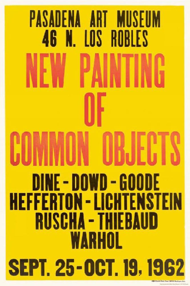
The Colby Poster Printing Company’s everyman quality and matter-of-fact typography has been valued by the visual art community as far back as 1962, when Ed Ruscha commissioned a poster to advertise his exhibition New Paintings of Common Objects, the groundbreaking first institutional survey of American Pop Art at the Pasadena Art Museum.* Colby Posters would later be appreciated as artworks in and of themselves, displayed at art institutions.
*Said poster for New Paintings of Common Objects at the Pasadena Art Museum was printed by revival shop Majestic, which Colby later incorporated in the mid-seventies. It is commonly referred to as a Colby Poster because its typography and commercial qualities are a close resemblance.
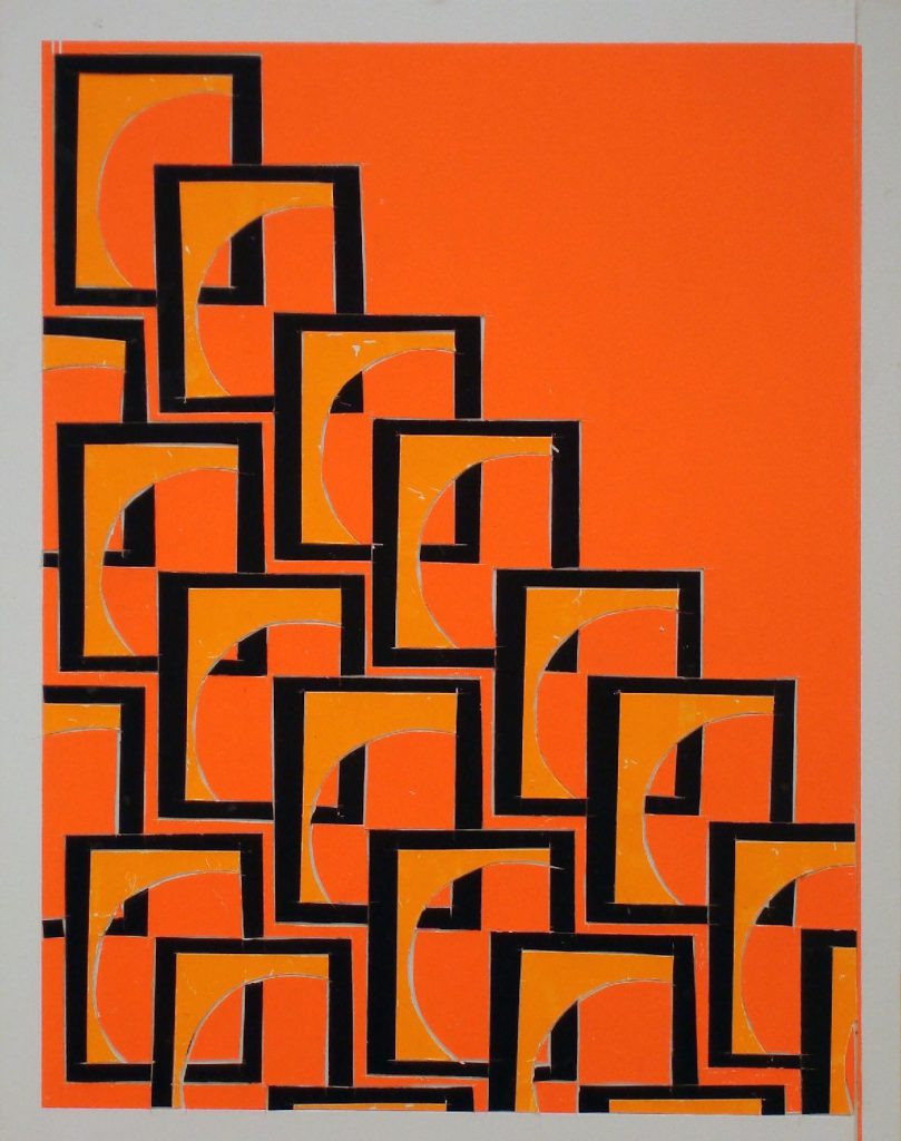
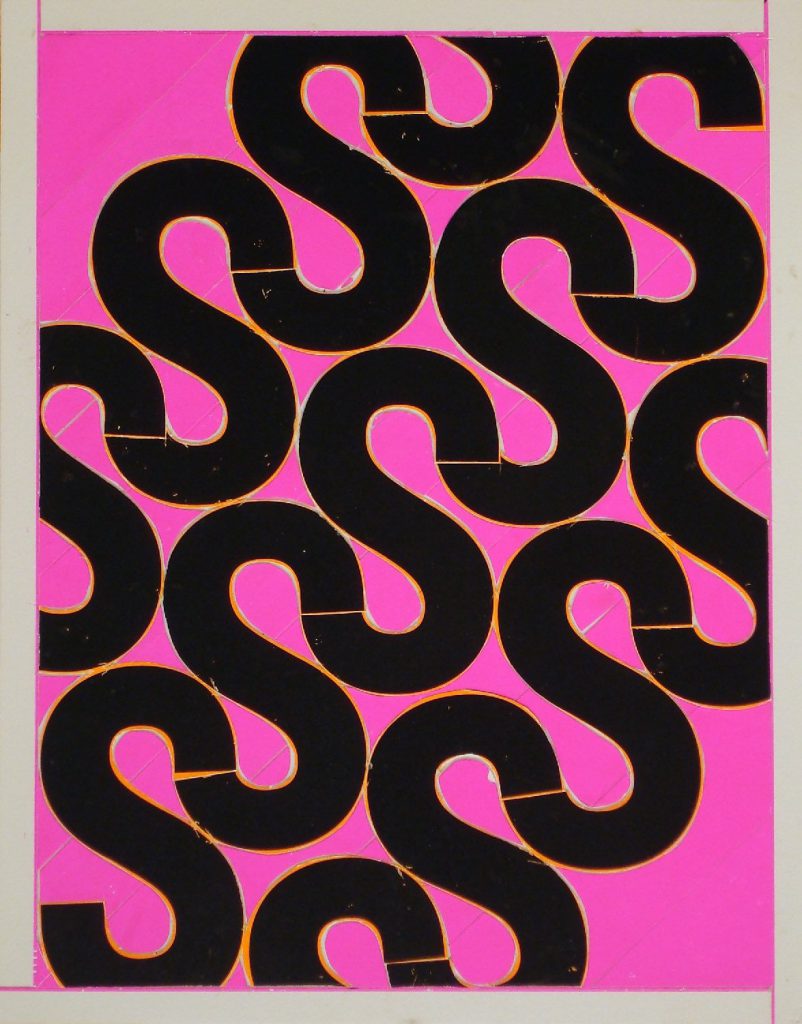
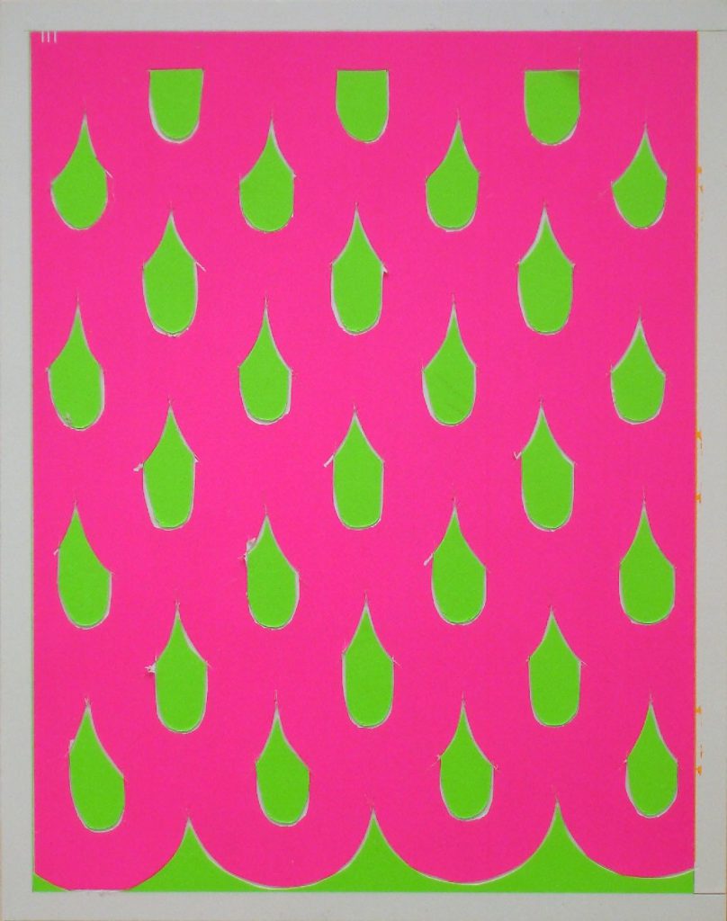
In recent years, the Colby Poster Printing Company’s typographic style has come to be synonymous with Los Angeles. Many contemporary artists and designers have used Colby Poster Printing Company’s services and mutable format—out of utility or self-expression—in such frequency that it has created a cult following. Three such individuals, Brian Roettinger, Jan Tumlir and Christopher Michlig, have such love and fanaticism toward Colby that they began an archiving project, culminating in the 2013 book and exhibition In the Good Name of the Company, a collection that draws no line between which pieces are ephemera and which are works of art. It is also heartbreaking, like an effigy, because Colby stunningly closed its doors in 2012 in the middle of their research—cutting short its rising popularity.
I chatted with Christopher Michlig about The Colby Poster Printing Company’s unassuming creep into the art world, the fluorescent reflection it casts on the meanings of Los Angeles, and the passing of a well-worn, well-adored print shop.
KH: Can you talk about what you feel is the relationship between the Colby Poster and the city of Los Angeles?
CM: The exceptional longevity of Colby’s letterpress printmaking process, a carryover from pre-digital commercial printmaking, relates in some ways to the cultural endurance of los Angeles’ unique urbanism—the old mixed with the new, continually overlapping and intersecting, constantly unraveling and coalescing. Los Angeles is in a particularly energetic phase of development, and Colby closed amid this; however Colby’s iconic, bold typefaces, split fountain gradients, and fluorescent colors convincingly constitute a popular shared public image of Los Angeles. If you think of the city as a group of crisscrossing sentences, Colby often took on the role of punctuation, giving inflection, tone, and disambiguating content. Jan Tumlir has equated Colby’s presence in Los Angeles with a kind of concrete poetry, both in terms of it’s embeddedness and the way it orients the passenger-pedestrian.
KH: What drove you to archive these posters?
CM: Brian, Jan, and I had been loosely researching Colby’s history as it related to artists commissions and collaborations for about 2 years before Colby closed. We had zero knowledge of an archive. for my own collage process I always maintained what I referred to as an “inventory” of posters that I constantly collected from the streets after the events they advertised had passed. I mercilessly ripped the posters down at night, and chopped them up in the studio as a subject material. Sometimes, even if it was in the middle of the day in busy traffic I would pull over and put my emergency lights on. I would jump out of my car, cross lanes of traffic, stand on newspaper boxes, climb telephone booths, to grab a fluorescent pink poster, for example, which was a very uncommon color. or any poster with the letter “h”, because “h”s are a low frequency letter. There was an internal economy to the posters, aside from their social and cultural cache, that I became fluent in - typefaces, particular hues, compositions - and my work depended on the transference of those qualities through collage. When Brian called me to tell me that Colby was closing I really panicked. I was in my studio at the time and as I was on the phone I was looking at the big stack of posters I had amassed, scraps everywhere like usual, and suddenly I froze up. At that moment my raw material became an archive - just like that - it was instantaneous.
Later that week Brian and Jan visited Colby and glen revealed the Colby “archive” as it were. Which was really more of a physical record of past jobs, not maintained as an archive per se, but literally stacks and stacks and stacks of posters reaching back to the late 1980’s, on modest plywood shelves in a storage closed. Glen agreed to lend the archive for the project and we have kept all of the posters together. It’s an incredible mish- mash historical record of merchant posters and artist projects, in no particular order, uncategorized, totally nonhierarchical.
KH: How would you describe the process of working/printing with Colby?
CM: Glenn Hinmann was the go to Colby person for artists. He was incredibly gracious and pragmatic and supportive. He loved working with artists, because as he always said they were polite and always paid with credit cards. Colby was a union print shop so artists could not be directly, physically involved with the printing process, but rather participated at an arms length. Glenn understood the significance of that dynamic, and always synthesized those two poles. There was a spectrum of involvement, or art direction, that was possible, and the exhibition represented that range - from prints that were phoned or faxed in, to prints that were typeset with great particularity of composition, typeface, etc.
As an example, in 2011 I constructed a collage invitation, letter-by-letter from my archive of Colby posters and scraps, for a group exhibition at LTD Los Angeles. I then took the finished collage to Colby and asked them to typeset and print a “copy” of it as a small edition, which we then stapled up around the neighborhood adjacent to the gallery. When I took the poster in, I felt like I was turning myself into the police. Glenn was sort of shocked when he realized how I had made the poster, realizing that I had obviously cannibalized several posters to make the collage. he was simultaneously enthusiastic about the challenge of reverse engineering the collage to then make a print of it. The resulting print is astonishingly close to what I brought in, despite reckless kerning and tracking, and irregular typefaces on my part, but also something entirely new and even better, because of the magical translational quality of the Colby process.
KH: How would you say Colby evolved from ubiquitous populous medium into a vehicle for poetic or artistic expression?
CM: That is a challenge question! At a certain point, Colby posters evolved from being things, posters, in the city, to be- coming so inseparable from peoples’ mental image of Los Angeles as an urban center that the posters themselves became a part of the city, if that makes any sense. So, at a certain point, making a Colby poster became a way for artists and designers to be the city, speak with the voice of the city, through the printing of a Colby poster. The idea of “voice” is often used as a shorthand for the idiosyncratic thrust and tone of one’s creative mode, and Colby was the voice of los Angeles: bi- lingual, landscopic, transient, metamorphic.
KH: Many interesting artists and thinkers such as Reyner Banham, Ed Ruscha, Joan Didion, and David Lynch have philosophized about this city. Do you have favorites within your Colby archive (artistic or merchant), which might aesthetically embody some of their ideas of an “LAness?”
CM: Banham connected his four ecologies - Surfurbiua, the Foothills, the Plains and Autopia - with a social language of movement. The city in this way is freed from conventional notions of “city” and is characterized by interdependent systems which produce their own distinct character, continually overlapping, splitting, and coalescing. The wide strewn distribution and appearance of Colby posters throughout the city reflected that idea, both in the way that their irregular repetition constantly reminded one of where they were, in a general sense - moving through los Angeles - and also in an ecological sense ala Banham, the posters were often distinctly community-specific. The gradients functioned this way, signaling and reflecting cultural and social specificity, as did the text elements - sometimes in Spanish, sometimes in English, sometimes speaking to specific audiences, sometimes speaking to anyone and everyone.
As for favorite posters, I am especially fond of the merchant posters. I have a TV Cafe poster that was the first I remember seeing regularly, which features a drastic range of type size and style on a red/white/ green split fountain gradient. The TV Cafe has long since closed, but it was an iconic downtown food destination that was open 24 hours a day. You placed your order with the staff who were behind 2 inch thick bulletproof polycarbonate panes. The ambiance was pure pre-re-redevelopment downtown dangerousness.
KH: What now? Colby is gone. What impact do you see happening to LA visual culture in its absence? How will its voice change or remain?
CM: Colby is irreplaceable and inimitable, as is obvious by the half-assed Colby knockoffs that local commercial silkscreen shops are now pumping out to fill the void. What has been lost is a kind of tactility, an aura and authenticity that is immediate in the hand typeset Colby poster. Colby was all about legibility, but also about specificity - the specificity of the city, in the Lefebvre-sense. When a city stops reproducing its own history, the stakeholders change also. There is a cultural shift taking place in Los Angeles, which despite its rich and idiosyncratic history is the result of the forcefulness of globalism, from which nothing is immune. Los Angeles, despite its history of making, also has a rich history of forgetting. III
(figure: c1.jpg)