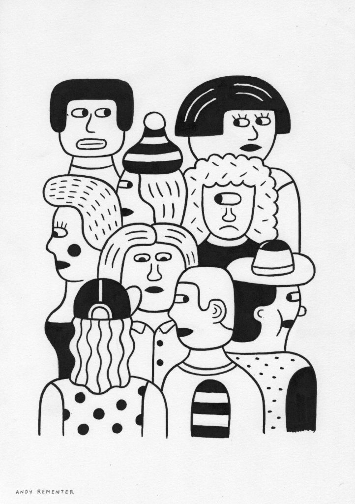
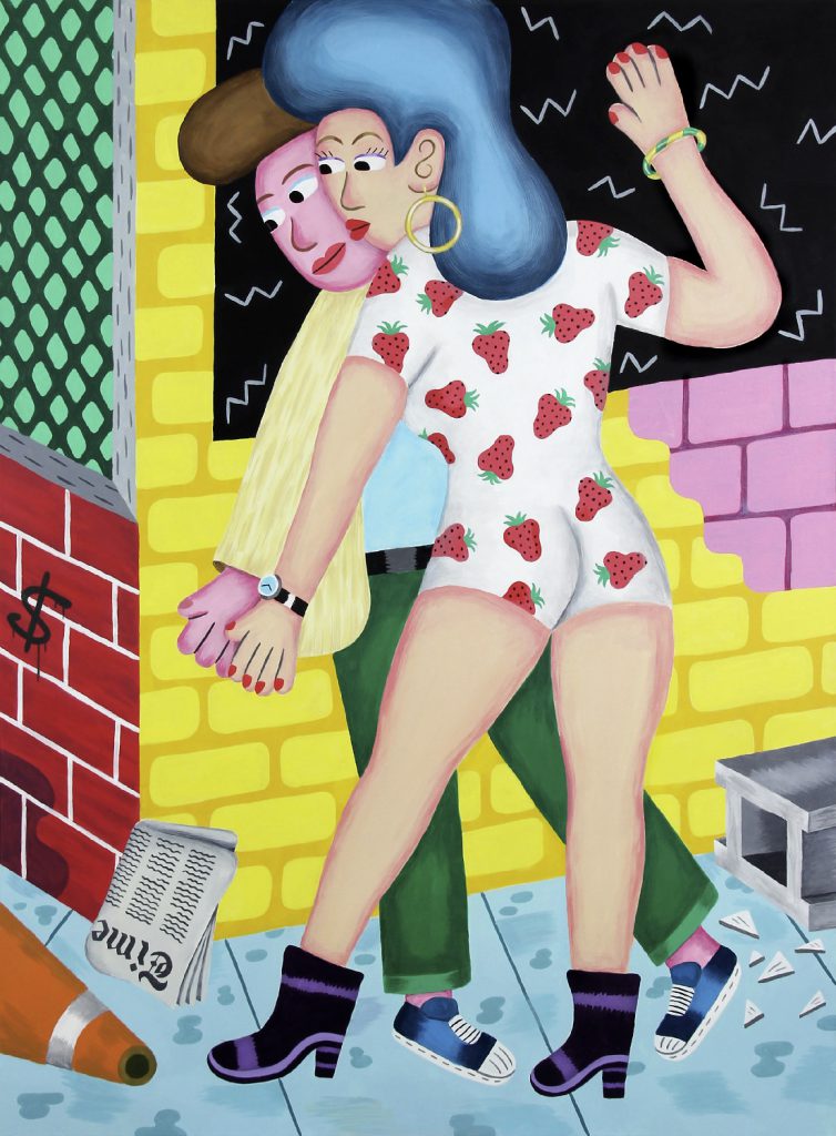
Andy Rementer
Maybe it's because Andy Rementer grew up in Cape May, a seaside resort town where vacationers have flocked since the '70s for a dose of good clean family fun. His color palette is not unlike the one you might've used in an elementary school art class, and the diverse cast of characters that reside in his paintings and illustrations seem to have been cut from the same cloth as his hometown's vintage storefront signage.
Upon first glance, everything in Rementer's world looks hunky-dory–but the narrative he pursues in his work spans the themes of isolation, misanthropy, catharsis, and joy in equal measure.
KT: Your work has a very particular sense of place and time. What would you say are the ideas or qualities that inspire the setting in which you place your characters?
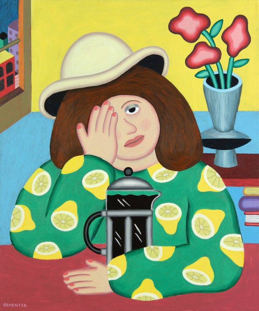
AR: People and emotions are at the center of much of what I do, and nostalgia is a common thread throughout all my comics and paintings. I’m from a Victorian beach town, where the faded hand-painted signage, the aging arcades, and the repetitive sounds of the waves almost change your perception of time. The memory has been crystallized in the way it appeared in those days, the gingerbread houses; it’s very calm and tranquil. In my work, I often try to get to a familiar place that is not now, but also, is neither the future nor the past. Perhaps it’s a place that represents a present moment, if mobile telephones and the Internet didn’t exist.
KT: Past the innocuous color schemes and the elementary shapes that pervade your work, there’s a compelling, and sometimes fraught, narrative. What’s the relationship of this juxtaposition of content and form?
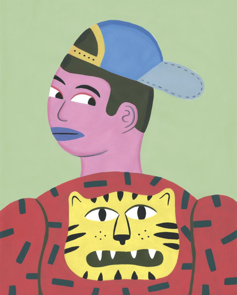
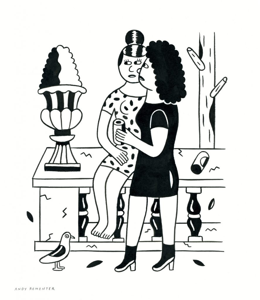
AR: I’m really attracted to pleasing images first and foremost, and I’ve developed a visual language that reflects that. I like to bring personal experience into what I make. I think comics are a great way, a great vessel for that. Storytelling is very important for me, and comics are a natural way to pursue that. I like the juxtaposition of bright color palettes; they’re more approachable, but there’s always something deeper, darker perhaps, beneath the surface. I’m always drawn to stories that convey something difficult to say.
KT: How does being technically color-blind affect your use of color in your work? Are your works intentionally more sensory by nature?
AR: Being technically color-blind has caused me to become much more comfortable employing bright colors and lots of contrast. It’s just easier for me, and no matter how hard I try to use a muted palette, I always return to the brighter ones. I can’t help it. I’m so naturally drawn to colorful and bright images, and have always been attracted to the colors of the ‘70s; you could call it the Sesame Street effect perhaps. I’m not a trained painter or a trained artist at all. So I’ve developed my own visual vernacular just through my own processes and explorations. And I’ve never really been interested in making
an object look like an object, in capturing realism for realism’s sake.
KT: Satire and misanthropy are present in the narrative of your work. Are these elements of your own worldview that find their way into your characters’ worlds?
AR: I do a lot of stream of consciousness drawing in my sketchbook, and perhaps a reflection of my worldview comes out on the pages. I’m a critical thinker by nature and a natural skeptic, but at the same time I often simply draw what I overhear, observe, and stumble upon. It’s almost an empirical method. I’m also a huge fan of French New Wave, Godard’s crazy primary color title sequences, and color palettes of Truffaut’s film. There’s the Antoine Doinel character of his that I’m just obsessed with. I love those films, and the stories are so simple in a way. But there’s a lot going on, and he’s such a likeable character. You’re rooting for him so much, but he just can’t succeed, he messes up everything, again and again. It’s super tragic, he’s always having
troubles with love. And that’s the one thread that sort of ties everything together: the idea of successive futility, always being knocked down, in some way or another.
KT: Who are some of you artistic influences?
AR: Discovering the work of Robert Crumb was a groundbreaking moment in my creative path—the idea that you could actually express yourself through drawing. I have always been a timid person, too shy to share my feelings, so it was liberating to have a visual outlet. I love artists who are able to draw in a pleasing style, only to discover there is much more beneath the surface. Cartoonists like Daniel Clowes and Chris Ware are great examples of this. I want to say I experiment with comics, I’ve been creating them, but only to the extent that serves my own purposes. But I’m an outsider to the underground comics
world, and don’t claim any association as such. I’ve never really been super deep into them, but I respond wholly to what I see. Art Spiegelman, Clowes, and then less political or overtly political artists like Ware. He’s another huge inspiration for me, more formally. Because of my graphic design background, I was immediately drawn to his work. Everything is so organized; it’s very structured, with a big emphasis on typography, too, which I also have. I’ve always been inspired by the art of the Middle Ages, the paintings, mosaics and sculpture. There’s a narrative quality in much of the work from that period, while I love how artists from that time naively stylized what they saw, instead of trying to render real life perfectly. The mosaics found in the churches of Ravenna are unbeatable, as are the brilliant frescoes of Giotto. I’m not so interested in the religious elements, but I’m very fond of the storytelling and visual aspects of the art in that era. The paintings of Diego Rivera, Botero and Léger are hugely endearing to me too. Alongside the visual language of each of these artists, I love their knack for composing a subject matter, in a way that entirely fills the frame, wholly drawing you in. Something I try to capture within my own work, there are also several English painters I look to, including Edward Burra and Stanley Spencer. I relate closely again to the storytelling qualities in each of their works, and their emphasis on cityscapes.
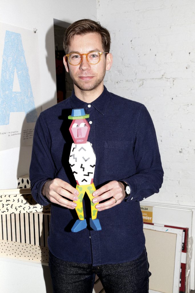
KT: Recently you began experimenting sculpturally with your series, People Blocks. Are you attempting to evolve beyond the limited dimensionality of print?
AR: It’s only natural for a visual artist to look to other mediums, to expand what he or she is doing. While I love print and animation, I’ve always loved the idea of a physical object: a book is satisfying to me in the same way as a canvas painting. A three-dimensional object was a new step, and one of the most exciting projects I’ve ever done. With these People Block characters, yes, they’re individual sculpture pieces, toys, art objects. But there’s an component of interchangeability that you could say you’re then able to construct your own narratives with, or create relationships between the characters. There’s a lot of physicality and interactivity to it, which is part of my slowly finding ways to adapt my visual worlds into other mediums.
KT: Your work incorporates an unmistakable element of handcraftsmanship. Is that a conscious homage to organic creation in the age when such efforts are largely neglected?
AR: No, I wouldn’t say that it’s conscious, that I’m not going to use illustration programs for example. It’s nothing like that. I admire artists who can just work solely on a computer. It’s just more that my education, my creative upbringing, has always been reliant on using my hands. Often when I try to incorporate new things into my system, it doesn't work; however I'm always trying new things and experimenting too. So I just have to keep going through my process. I’ve developed a working process, and as Robert Crumb says, “Old ways are the best.” I love seeing the hand. And I think now more than ever, seeing the hand of an artist is becoming more appealing. I strive for imperfection. And that’s the other thing, I’m a perfectionist. I think I’ve always been, and then especially with my background in graphic design, taught by older professors from the Swiss Basel tradition, those who were all very focused on rules and grids, I have that ingrained within me, and I can’t let it go. So it’s often hard for me to break the grid and have more spontaneity. There’s an organization in my work that even when I try to free up somewhat, it just doesn’t happen. There’s always a dialogue in my mind, going back and forth: embrace it, let it go; embrace it, let it go.
KT: Finally, what are some of your upcoming projects?
AR: It will either be a longer-form animated narrative or shorter animated videos with some kind of content involved that is not so formal. I’d really like to push that. I want to continue creating worlds, to auteur, to realize one hundred percent of a vision and construction of a world; not relying on real stuff or things going on now. It’s a timeless thing, a way to create, and I love that. I’m also working on a series of drawings and paintings for a show in Tokyo in April. A product collaboration that I'm very excited about will be launching soon; for now I can only say that it's a wearable object. And of course I'm continuing my storytelling and narrative work.