The Rodina
With Melissa J. Forst
Conversation with The Rodina, shortly after their Neo New York presentation at Cooper Union:
MJF: It was funny to see the presentation, because I think I read that work differently when looking at it online. It’s hard to tell with a lot of things where the line of sarcasm is, and where the sincere line is. So starting with love...
TR: It’s in our culture. We are from middle Europe. It’s all sarcasm. Czech style—we work with it a lot. The sarcastic point was that we’ve educated ourselves. Meeting clients we needed some story to sell things. So, there is a sarcastic point. In our case, through our self-education, that’s how we create our reality. We can connect different points of view, and then we can collaborate and discuss things from different angles. We think that’s a serious way of working.
MJF: So are you guys actually married?
TR: Yes! (in unison) This is the ring! It’s legit.
MJF: Just checking. I don’t know what the reality is. What is not sarcastic? I do see some themes that seem sincere because they come up again and again. Certain things about different cultures, a relationship between global culture...
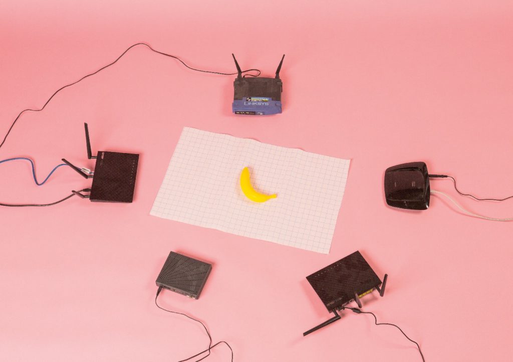
TR: Yeah, we’re global and the internet thing is still there. We know it’s boring to say that, because it’s overused, but still, we are dealing with it a lot—with the blogosphere, for example—but that’s not sarcastic for us. It’s very sincere to do graphic design. It’s not a joke. Probably, it’s in our approach that the work we make should create the environment around us. It's not just service. We should choose our clients and not just sit there waiting for a miracle.
MJF: You were talking about the physical object-ness of things and, as graphic designers at this stage, usually the physical object is not as important when you’re working completely on the computer... well, are you working completely on computers?
TR: Not completely, but a lot. We do sketches and we also do little models. For example, dummies of inner book structure. When you work with pencil, you sketch faster and use a different mindset than when you work with a computer. We didn’t believe in it, but now we understand. And then we mix a lot of different softwares. It’s more about the juicy combination of unusual tools, like the 3D stuff.
MJF: I’d say a lot of people think that’s a dated idea because, as computer technology becomes more assimilated into our lives, it becomes more like the process of sketching. It can be just as intuitive.
TR: Yeah, but it’s a fact that there are a lot of things in your brain which are connected with your body. Therefore using your hand is much more simple, and we can work with that, but then we always go digital. And we also use and test the medium of performance art, so then we go physical again. Our work relates with music, so the process of creation is really more expressive-intuitive. On the other hand our working process is based on a dialogue, is more organized and structured. We both do research and concept. But Vit didn’t know what Conceptual Art was five years ago. He has a background in Psychology and Architecture (laughing). Also, we claim that we design affordance, not forms. Affordance is what things like environment or a whole visual identity or a poster offer; it’s about its hidden capacity. It constitutes a full field of potential and possibility of action, and it’s up to us designers to find that.
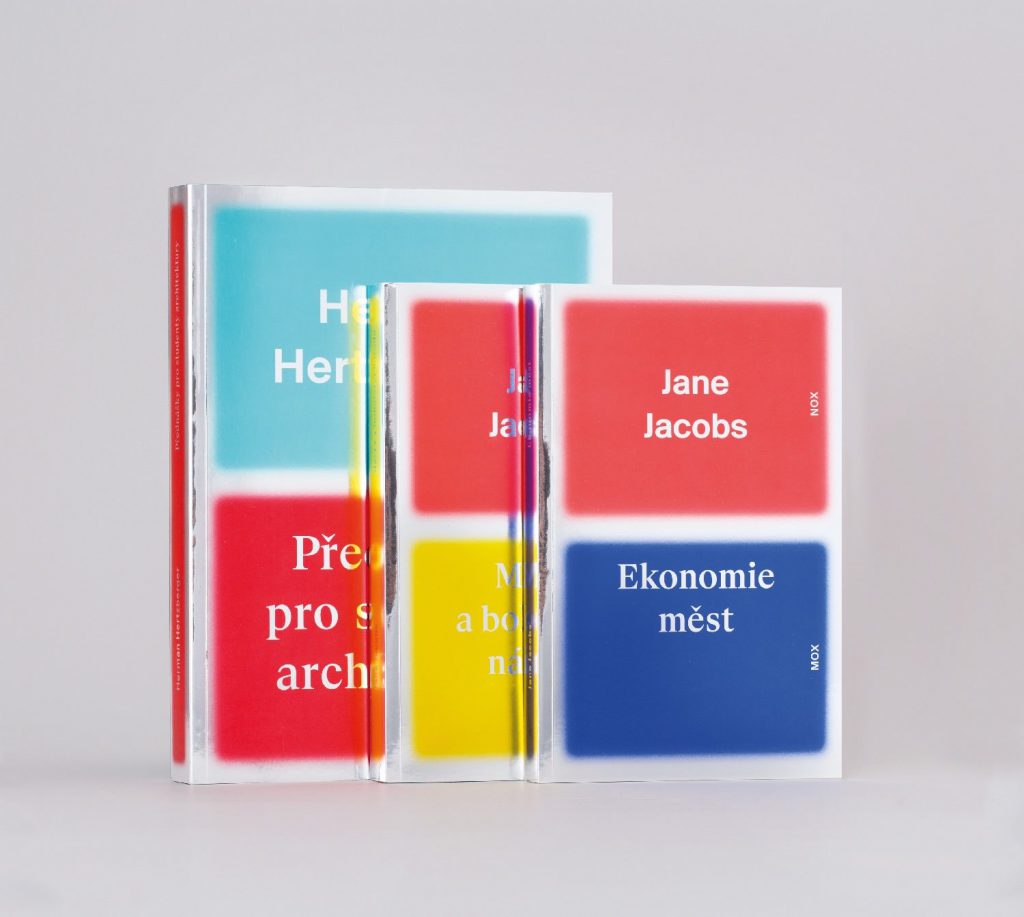
For instance, an ocean around a tropical island offers you the opportunity to swim, taste the salty water, observe small fish, watch the horizon, or dive for pearly seashells. A real example from our practice would be the book, "The Internet Wise Glossary," which was not finished after we printed it, but rather once it was covered with stickers. Then the book became an object. An extra aesthetic value was given to it. The stickers were attractors and established connection with post-internet art subculture. It’s important to feel free; we can do a web or we can do a poster if it’s possible with the clients. If we really want to do something, then we try to convince them. This is about introducing the idea that what we present is the right way or the only way to do the job right, even if it’s a bit different than what the client expected.
MJF: How much of your work is client-based? Is some of it independent?
TR: 80% is client-based. When we do something by ourselves, it’s when we organize workshops. Then that’s our idea, and we spend a lot of time and money on it. This is what we really want to do. We have this strategy, but we are not sure if it’s a good working strategy but we are still using it. So, when we do something like this we just do one part of it. For instance, if we want to educate Czech students, we need to organize workshops. Then we invite friends—other graphic designers—to create the visual identity. And we invite other designers to run the workshops. So we become managers. It gives us the opportunity to meet the people we know only from the Internet in real life. That’s cool, right?
MJF: The other designers that you tend to want to collaborate with... do you think they consider themselves graphic designers? Is everyone basically like you, where they don’t feel like graphic designers?
TR: That’s a big discussion, a terminological discussion. This discipline is not progressive to the future. In Germany and Switzerland they are called communication designers. They don’t use the term graphic design anymore. And other designers describe themselves differently, as Art Directors. We started to call ourselves "memory designers, because we design memory." Every printed matter is like a memory. We think pure perception and pure memory exist only in theory. Because perception is always affected by memory, and pure memory is dependent on the brain.
MJF: Is your work recognizable just to your own process or to the time of the world?
TR: Yeah, it depends on the context of course. We can say that we can be visually inspired by stuff around us, but the visuals don’t mean that we can work in the particular style or trend.
MJF: I don’t mean "design trend," I mean what is going on in the world.
TR: Yeah, we realized that working within a social context could be very strong. We are just investigating this, these new possibilities of design (affordance haha). For example, this video, “Farting for the Ukraine,” where we wanted to connect the farting to some form of political protest. Being revolutionary could be fun, but at the same time it’s something serious; two weeks after that video went online the first people were killed in Kiev. One guy made an iPhone application for farting five years ago and he was quite successful... but he could have connected it with something more important.
MJF: I’ve been watching this happen here as things get more ridiculous. Comedy seems the only way to approach what is going on. We have The Onion, a satirical newspaper, but it can also get really heavy because it’s able to show how absurdly fucked up things are by making a joke of them. The same with two news shows on the Comedy Central channel here—they show the absurdity of news and politics. It shows the absurdity through parody. It shows the truth so much more, which is disturbing.
TR: Yeah, it might be because the audience is bored with the reality, which is just really sad and heavy, that it’s much easier to connect with them through this... oh–wait! (Tereza is thinking hard) it’s such a famous artist. From a long time ago, in Spain, like in the 18th century. No, it’s not Velazquez... it’s Goya. He made these drawings (aquatint prints) showing in detail the tragedies and disasters of the Spanish Independence war from France, as a form of protest. We want to see sometimes that civilian form of effort, civilian strong things and social change. If you want to integrate within a culture or media stream you have to use contemporary language. That works also in a visual way. That’s the reason we do these kind of strange balls everywhere. Because of Goya’s legacy...
MJF: Wait, what are those strange balls?
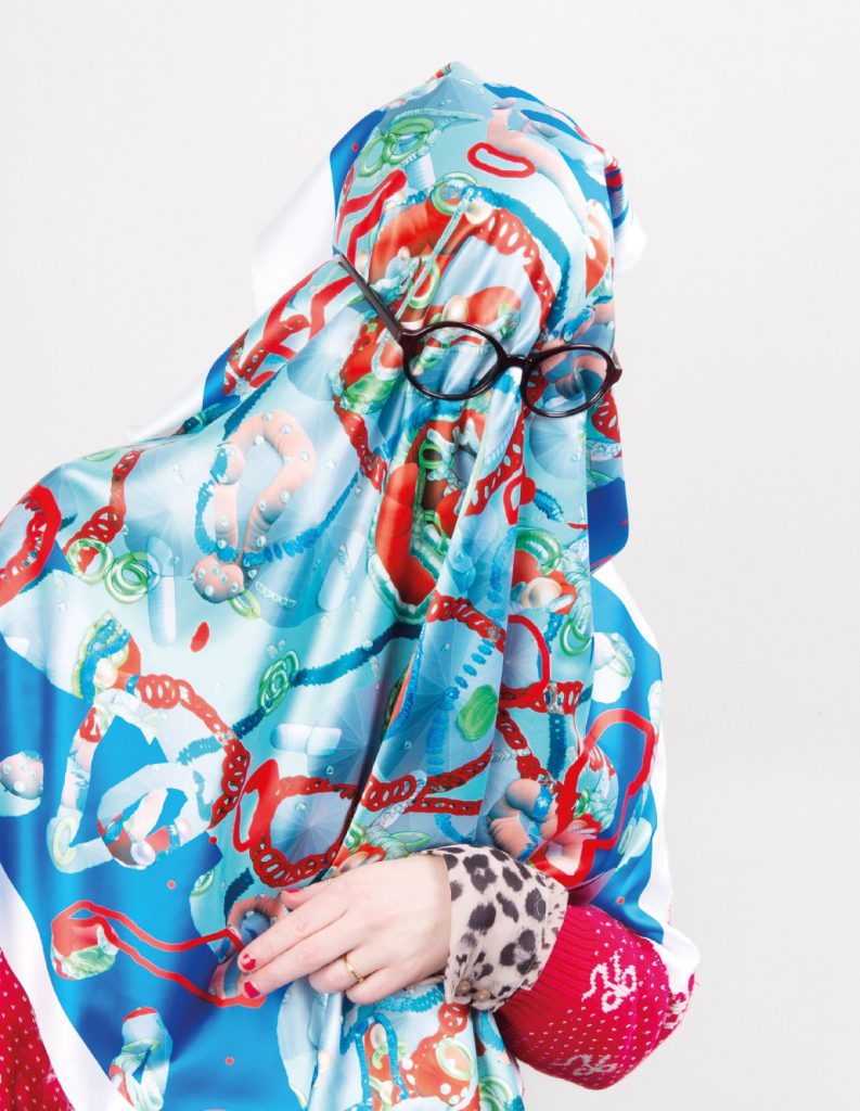
TR: Our Z-Brush / 3Ds Max balls. We don’t have to use the rational language of the existing media, and we really don’t believe that if you give people enough information they will change something, it’s really absurd. Sometimes it is necessary to use some manipulation to get the right thing... One month ago, we were discussing that if we will have to fight against Neo Nazis in Europe, we would never use their visual language. To fight them, we would not design the stuff mimicking their visual language. I mean using the red and black and bold typefaces. Rather than that we will draw the swastika with these offensive bullshit 3D balls, that would completely destroy their image.
The hippies are a very good example; they had a special language to fight against conventions, do you know what we mean? So, if we want to do something to change society, we should do something really crazy and cynical. We believe this would disturb the system in the right way.
MJF: Can visual activism actually translate into the real world? How would that happen, is it just true culture?
TR: It’s difficult. There has to be the unity of content and image. Most of the political things we know are just different in content, but visually they communicate and look the same. We think that’s the problem. The hippies and the 1960s movements were quite good at it. If visual artists or designers want to push things further they have to develop new visuals. It’s funny, in schools students are still doing some fucking posters against something, but posters are not popular any more. If you check their portfolios, they usually present their online posters surprisingly in a very static way. It's ridiculous, posters are often treated in a portrait size. Why don't they ever change the shape of it? It’s sad to see that everything is still the same, even when you use different software.
MJF: And the thing about using software is that you’re always working in the parameters of the person who programmed it, so in that sense we are always restricted. So while these kids are working more within these parameters, we are all kind of stuck.
TR: This is about the role of the future designer, a designer who establishes new tools together with the programmers or with the coders. Create software for people to use. These days you can generate your own posters for a party so easily on the Internet. There are several websites where you just have to upload your information and it will generate a poster for you, and it would look like it’s from a good designer, maybe too "trendy." That makes you think about the role of the designers. The thing about these products—software—is that they make everybody think the same way, and in that way somehow control your mind. Some people really hate Adobe products, so they do this open source thing...
MJF: What kind of programs are you guys using? Mostly just Adobe?
TR: Yeah, for professional print we are restricted to use it. We still hope we can control it. It’s funny though, we do a lot of graphic design in architectural software. That is a different style of thinking.
MJF: It’s funny because in architecture they’re, like, really restricted about how things look. I was thinking about how in architecture there is definitely a thing where a lot of people can look at buildings and can tell what kind of version of AutoCad or Rhino they were made on. The building resembles the drawing, and the drawing had a lot of the program in it. So, I think it’s funny that you’re using architecture programs to make something crazy. Because those programs were definitely set up to... I mean, there are things like Grasshopper that were set up to make weird things, but they’re not really meant to make things that you build. You know?
TR: If you need some unfamiliar generative tools, it’s better to take them from architects or artists than from graphic designers. These softwares, for example Grasshopper or z-Brush, don’t use the common graphic language and are restricted from visual world. We like breaking rules... or more, like, we like playing a game. That’s visible in our way of documenting our printed and digital work. We always try to prove that it’s real. For example, sometimes we do print screens when the work is shared on Tumblr or somewhere else in the cloud. Or we put plastic tomatoes on the poster. It’s very stupid, but important for us. (ha,ha,ha)
MJF: I thought they were part of the poster!
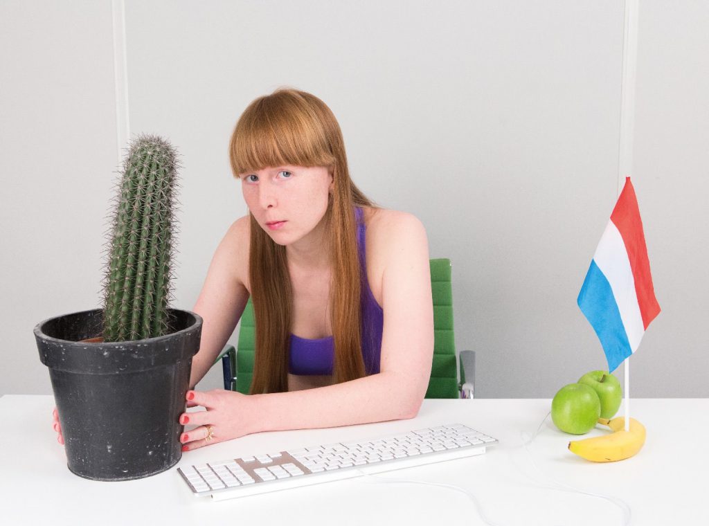
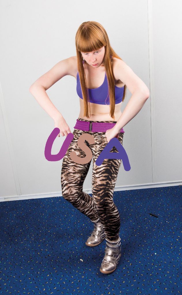
TR: Well, those tomatoes were part of the presentation of the poster. We prefer to link the finished design to the person who created it these days. So Tereza holds a poster every time we document it. We enjoy the fact that when you finish your design and print the poster it’s still not finished yet. We like the constant change or development. You can revisit the work again and again. We also tend to show the work to the public before the client. Naturally, some of the clients don’t like it though. (laughs) Some clients write to us: “Please, please, please hide it, don’t show it, show it to me first.” But why not show it? There is no universal rule about why you wouldn’t do it! Sometimes we show the process. If we feel we want to do that, we go for Facebook or for Tumblr and post it there! It’s fun!
It’s about sharing our ideas with people. Sometimes you ask somebody who’s creative, or somebody you look up to, for help or a source or explanation of his stuff. Unfortunately he/she wants to hide his/her sources, or the name of the software used, and it’s really shitty, you know? When somebody ask us, we explain totally how we make things, what we have used and the whole process. This copyright thing is a little bit absurd.
MJF: Everything is copyrighted by the God of the Internet, so... (everyone laughs)
TR: Yeah, but we should be better in stealing or be inspired by other people’s work. We have to work a lot on this. We are really limited by our culture, we don’t intend to steal things, but we should. It would help, at least.

MJF: You don’t have to steal things, necessarily!
TR: We think that at least in order to learn more, you have to. In "Uncreative Writing" by Kenneth Goldsmith, there is a really brilliant idea where students are pushed to rewrite great existing works. It is not about writing like Kerouac, but to really rewrite/steal every sentence, as a way to understand his process and certain decisions. For instance Vit worked in many architecture offices, and he experienced that the work process in real-life is completely different from what they teach you in school; that is, to be unique and cool. Forget about that, in praxis, a lot of offices just take and mix stuff from magazines, especially in competitions. We think it’s a problem in the Western World when the public image of your unique creativity is completely different from the reality.
MJF: Especially now that everybody is a graphic designer.
TR: Yeah, thousands of graphic designers... III